Ton Sur Ton Decoration Guide
If you are thinking of reshaping your home or office and want to create a calm and elegant atmosphere that draws you in, ton sur ton decoration can inspire you.
Tone-on-Tone Decoration Guide
If you’re thinking about reshaping your home or office and want to create a calm, elegant atmosphere that draws you in, tone-on-tone decoration can be a great source of inspiration. This approach goes beyond simply playing with colors—it allows you to skillfully use different shades of the same hue to achieve a harmonious and stylish look. When applied correctly, tone-on-tone palettes bring a sense of unity to your living or working spaces. Moreover, this technique gives your spaces a sense of calm, elegance, and noticeable depth. It also has the power to make interiors appear more spacious, brighter, and far more inviting. In this guide, you’ll step into the enchanting world of tone-on-tone design and discover how to bring this unique harmony into your own spaces.
What is Tone-on-Tone?
Tone-on-tone simply means using different shades of one color together. This approach brings harmony, simplicity, and aesthetic unity to interior design. When light, medium, and dark tones of a single color are balanced properly, it creates an atmosphere that is easy on the eyes yet highly impressive.
The tone-on-tone technique is often used in modern interior design. It helps create depth and volume without strong contrasts. When applied to furniture, floors, and accessories, it brings perfect harmony. Each piece works with the others, giving the space the feeling of being created in one smooth brushstroke.
Tone-on-tone colors stand out not only for their aesthetics but also for their psychological effects. For example, shades of blue bring peace and calm to a room, while beige and earthy tones create a warm atmosphere. That’s why achieving tone-on-tone harmony can be a smart choice for both homes and offices, depending on the purpose of the space.
How to Do Tone-on-Tone Decoration?
Bringing the nuances of tone-on-tone decoration into your space is like a painter adding depth to a canvas with different shades of the same color. To apply this refined technique successfully, every step should be taken with care and planning. The key is to let your chosen main color flow through the room while avoiding monotony and maintaining a balanced look that feels easy on the eye. Here are the ways to bring this captivating style into your living spaces, along with step-by-step strategies to follow:
● Choosing the Main Color: Define Your Favorite Shade
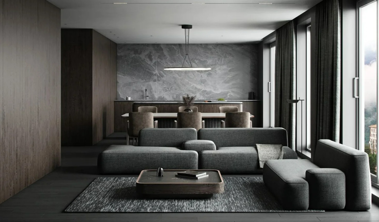
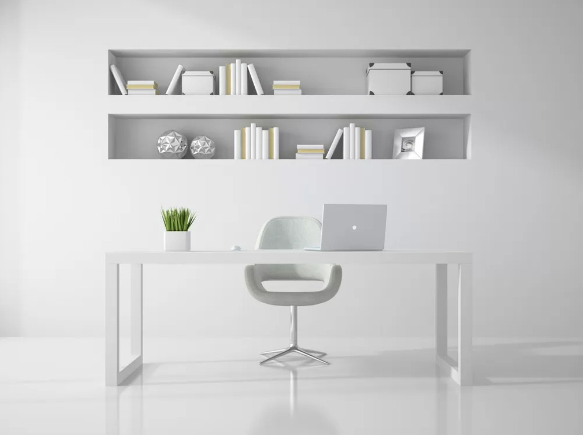
The first step in tone-on-tone decoration is choosing a main color that will define the character of the space. This color acts as the central theme of the entire design. Neutral and natural tones such as beige, gray, blue, green, or earthy shades usually blend more easily with other colors and create a base you won’t tire of quickly. By using different shades of your chosen color across various surfaces and objects, you can achieve a balanced look. For example, if your main color is gray, you might use a light gray on the walls, a medium gray for furniture, and darker gray tones for accessories to create a sophisticated effect. Applied this way, the tone-on-tone approach gives your design both a modern and timeless feel while reflecting your personal style.
● Gradation of Tones: From Light to Dark
In the tone-on-tone technique, it’s not enough to choose just one color; it’s equally important to grade its shades correctly. A balanced use of light, medium, and dark tones not only adds depth to the design but also creates a dynamic atmosphere in the space.
For example, using light tones on the walls makes a room look brighter and more spacious, while medium tones in furniture add warmth and a welcoming feel. Darker shades in accessories or textiles complete the decoration by creating a strong and striking focal point. These transitions prevent the colors from looking monotonous and allow for a natural, seamless flow between different areas of the space. Especially in larger rooms, tonal gradations help the space feel more balanced and sophisticated.
● The Importance of Texture
Tone-on-tone decoration is not limited to the use of colors alone. One of the most effective ways to highlight different shades of the same color is by combining them with a variety of textures. Matte, glossy, rough, or patterned surfaces make color transitions more noticeable and aesthetically pleasing. While a matte surface absorbs light, a glossy one reflects it—allowing the different tones of the same color to stand out more clea
Using different shades of the same color across various materials—such as paint, textiles, flooring, or furniture—makes the decoration look richer and more layered. For example, pairing a matte-painted wall with a glossy fabric sofa in the same tones adds a sophisticated dimension to the room. Different textures prevent monotony in the tone-on-tone approach and make the space appear more characterful and full of depth.
● Walls: Paint, Wallpaper and Plaster Options
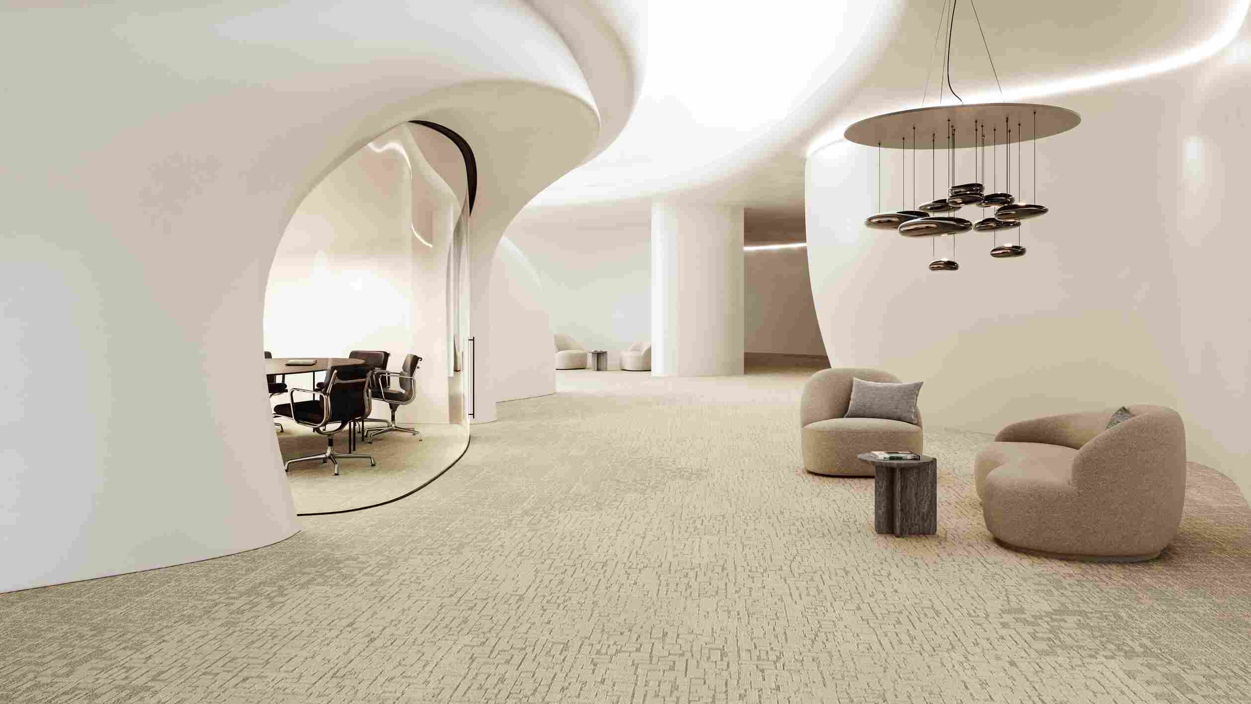
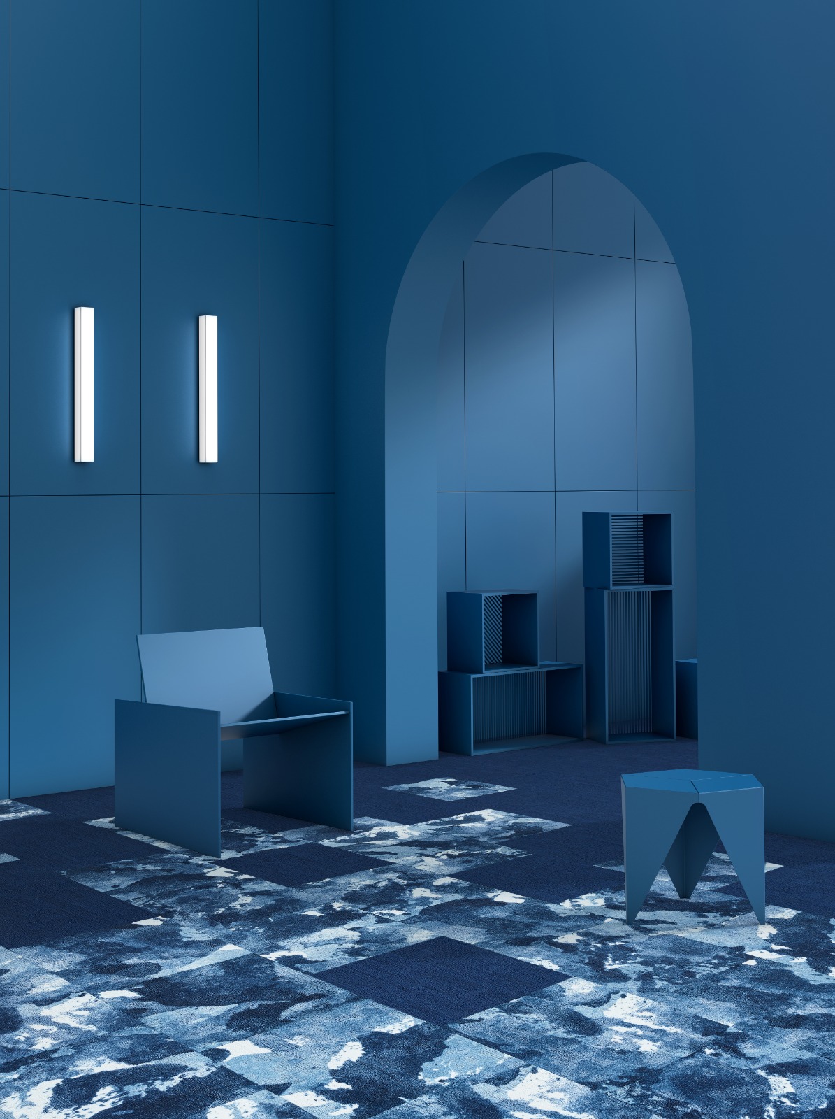
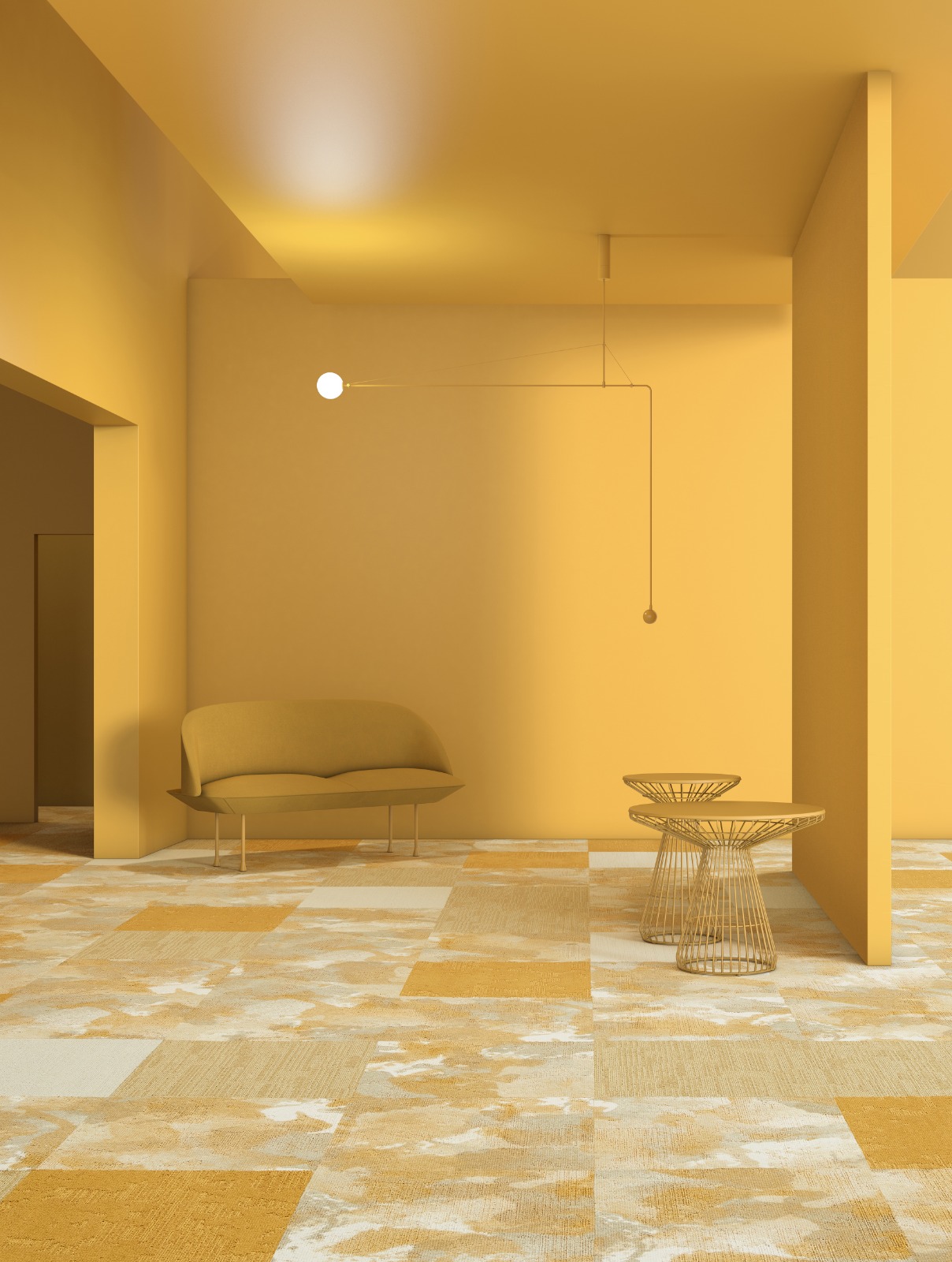
In tone-on-tone decoration, walls are one of the most important surfaces that define the atmosphere of a space. Light-colored walls bring a sense of openness, brightness, and spaciousness, while medium and dark tones create a warmer, more inviting atmosphere that draws you in. Choosing different levels of lightness within the same color enhances the depth of the room. For example, a light gray wall balanced with dark gray accessories results in a modern and elegant look.
Wallpaper also provides an effective way to add pattern or texture. Monochrome designs with stripes or geometric shapes in different shades further support the tone-on-tone approach. Decorative plasters or special surface finishes—such as concrete-effect plaster—add a visible texture and character to the space. In this way, tone-on-tone colors not only offer a visual feast but also create a tactile sense of unity.
● Flooring: The Role of Carpet, Parquet, LVT, Vinyl and Textures
Floors are one of the key elements that support color transitions in tone-on-tone decoration. Complementing the tones used on the walls with flooring creates a sense of unity and flow in the space.
● Carpets not only add warmth but also enhance the effect of different shades. Carpet tiles provide both an aesthetic and practical solution for tone-on-tone applications.
● Parquet and LVT (Luxury Vinyl Tile) reflect the warmth of natural tones while adapting to different color gradations. Light oak or dark walnut shades can be chosen wisely depending on the overall color scheme of the room.
● Vinyl and woven vinyl flooring offer both aesthetics and durability. Especially when tone-on-tone woven vinyl is used, achieving smooth transitions between different shades becomes much easier.
With this variety, flooring goes beyond being a functional surface and becomes a strong complement to the overall design.
● Furniture and Textiles: Fabric and Material Combinations
Furniture and textiles play a key role in the tone-on-tone approach, completing the overall character of space. Choosing major pieces—such as sofas, tables, and chairs—in the main color and then layering fabrics and materials in different shades of that same hue, creates a rich and layered look.
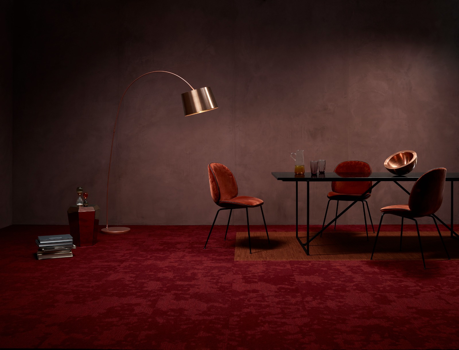
Choosing fabrics that mix matte and glossy finishes strengthens the impact of tone-on-tone design. A matte cotton sofa paired with velvet cushions in the same shade adds both tactile depth and visual richness. The same principle works with materials like wood, metal, or glass. A light wood table combined with darker wood chairs creates a warm, natural balance. Small touches through curtains, rugs, cushions, and throws add layers of color, giving the decoration a cohesive finish.
● Accessories: Artwork, Decorative Objects and Lighting
One of the most enjoyable parts of tone-on-tone decoration is adding the small details that bring life to a room. Choosing accessories such as paintings, sculptures, or other artworks in different shades of the same color creates a subtle sense of harmony. For example, if your main color is green, an abstract painting that shifts from light green to emerald will add striking depth to the wall.
Decorative elements such as vases, ceramic objects, books, or frames are subtle touches that strengthen tonal transitions and create visual layering. These pieces help different shades flow together, and even in minimal spaces, tone-on-tone design can be applied easily, with every detail adding a story to the room.
Lighting plays a key role in how tones are perceived. Light has the power to change the character of colors. Soft yellow lighting makes transitions feel warmer, more inviting, and cozy, while bright white light highlights tones in a sharper and more modern way. Lamps, floor lamps, or pendant lights can all be used to reinforce tone-on-tone harmony. You can even reflect this elegance in the fixtures themselves by choosing different shades of your main color.
● Contrast Touches: The Role of Gray, White and Black
In tone-on-tone decoration, harmony and unity are key. Still, small but effective contrast touches are needed to keep a space from looking dull or monotonous. At this point, gray, white, and black become the most effective complementary colors, adding balance and emphasis.
● White: When paired with light tones, white brings freshness and brightness. Details in white—especially on walls and ceilings—make tone-on-tone colors look sharper and more vibrant. It creates a kind of breathing space in the design.
● Gray: As a neutral shade, gray brings balance. It acts as a bridge between light and dark tones, creating smooth transitions. While adding a calm and modern feel, it also highlights the richness of other colors.
● Black: Black creates the boldest effect. Used in small objects, frames, or lighting fixtures, it gives the space modern depth and a bold character. When applied in the right amount, these contrasting colors add dynamism and visual appeal without breaking the harmony of tone-on-tone design.
How to Achieve Tone-on-Tone Harmony
Applying tone-on-tone decoration well requires attention to a few key details. Here are some tips that will make it easier to create perfect harmony in your space:
● Choose a main color that fits the room, reflects your style, and is one you’ll enjoy for years.
● Use light, medium, and dark shades of the same color in different parts of the room to avoid monotony and create rich visual layering.
● Balance different textures—such as matte and glossy, rough and smooth. Textures add depth and interest by bringing shades of the same color together.
● Add small touches of gray, white, or black. These neutral details give balance without breaking the overall harmony.
● Take into account how much natural light the room gets and from which direction. Light affects how colors are seen: daylight shows their real tones, while artificial lighting can make them look warmer or cooler.
FAQ
How to use tone-on-tone?
Start by choosing the main color of your space. Then use its light, medium, and dark shade across different surfaces such as walls, floors, furniture, and accessories. Combining textures—matte, glossy, rough, and smooth—makes the design richer and more layered.
Which colors are considered tone-on-tone?
Tone-on-tone colors are different shades of the same base color. There are no fixed colors, it can be gray, blue, beige, green, or any other color. The key is to use several shades of one color together in a balanced way.
Why are textures important in tone-on-tone design?
Textures are essential to prevent monotony. Using only colors can sometimes look flat. Materials like wood, metal, fabric, ceramic, or glass add depth, visual interest, and a tactile richness when combined with different shades of the same color.
What is the difference between tone-on-tone and monochromatic?
Tone-on-tone means using light, medium, and dark shades of the same color together, often with different textures, to create a layered look. Monochromatic, in a stricter sense, uses just one shade of a single color with little or no variation. Tone-on-tone is usually richer and more dynamic, while both styles aim for simplicity and unity.
Discover