What Are Complementary Colors and How to Use Them?
Complementary colors are pairs of colors that are positioned opposite each other on the color wheel and create a strong visual contrast when placed side by side.

Complementary colors are pairs of colors positioned opposite each other on the color wheel, creating a strong visual contrast when placed side by side. Examples such as red–green, blue–orange, and yellow–purple are some of the most well-known contrasting color pairings. In this article, we will examine in detail what complementary colors are, why they are so important in design, and how they can be used effectively in different contexts.
What Are Complementary Colors and Why Are They Important?
The word “contrast” literally means “opposition.” When it comes to colors, it refers to using two colors side by side that create a visually noticeable difference. Color contrast does more than create a visual effect; it also defines the mood and perception of a design. The importance of contrasting colors can be summarized as follows:
-
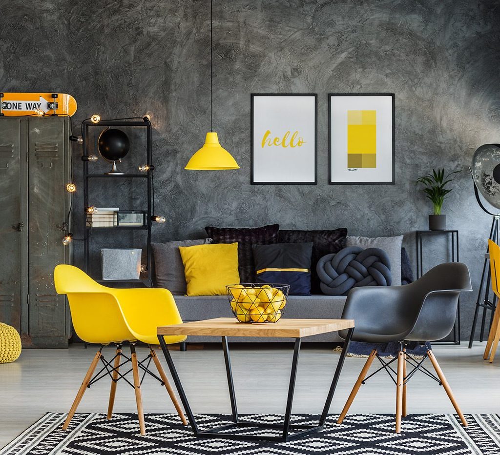
Opposite tones create strong emphasis in a space. For example, light yellow accessories on a dark gray floor immediately draw the eye. This is critical when you want to highlight a message or an object.
-
Proper use of complementary colors can make different colors appear harmonious together, preventing monotony and adding a dynamic look.
-
Contrasting colors can make a space appear larger or smaller than it actually is. Light-dark contrast particularly enhances this perception and adds depth.
-
Brands, logos, or interior designs can achieve a more distinctive appearance through contrast. Strong brands effectively leverage this principle.
Therefore, complementary colors are not only aesthetically important but also a design tool that directly impacts the function and user experience of a space.
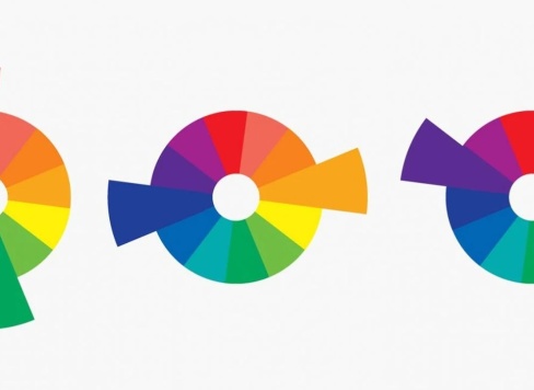
Color Wheel and Complementary Color Relationships
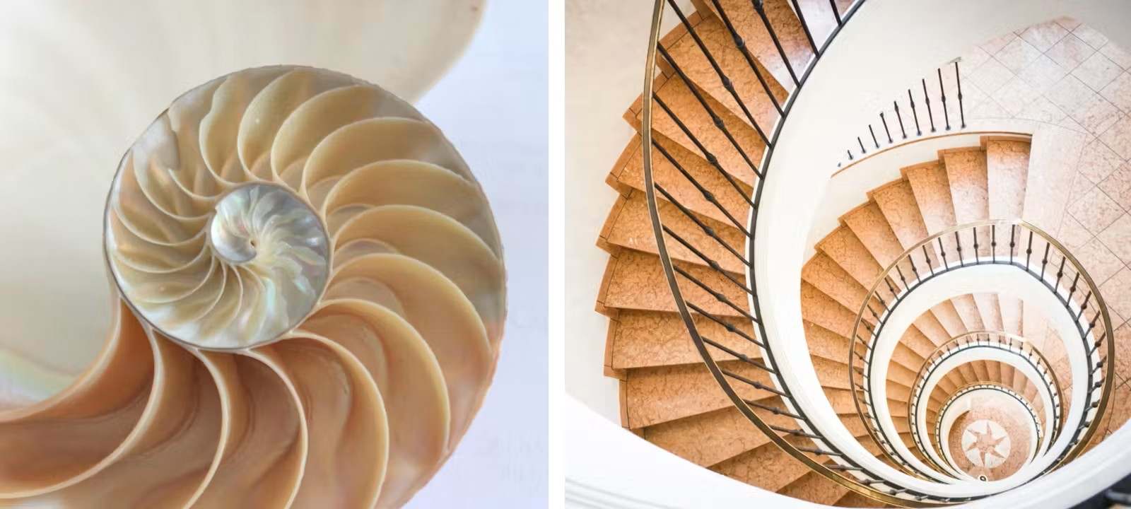
The easiest way to understand color contrast is to look at the color wheel. The color wheel shows primary colors (red, blue, yellow), secondary colors, and their variations in an organized system. Colors positioned directly opposite each other on the wheel are considered complementary or contrasting colors.
The most well-known contrasting pairs include:
-
Red – Green: Green is the complementary color of red, creating one of the strongest visual contrasts.
-
Blue – Orange: Orange is blue’s complementary color. Used together, they produce a vibrant effect.
-
Yellow – Purple: Purple is the complementary color of yellow, creating an eye-catching harmony.
The color wheel also shows different types of contrast:
-
Complementary Contrast: Created by using colors directly opposite each other on the wheel. This is one of the most dynamic forms of color contrast.
-
Light–Dark Contrast: Formed by placing different tones of the same color side by side (e.g., light gray vs. charcoal). The difference between these tones is a classic example of this contrast type.
-
Warm–Cool Contrast: Occurs when cool tones like blue or green are combined with warm tones like red or orange.
These relationships allow designers to make a space appear more lively, balanced, or dramatic. In flooring design, complementary colors can be used to energize a space or create a calm atmosphere depending on the function. A contrast color chart makes it clear which colors oppose each other and how to use them—for example, brown often pairs with light blue or turquoise, while pink works beautifully with various green tones.
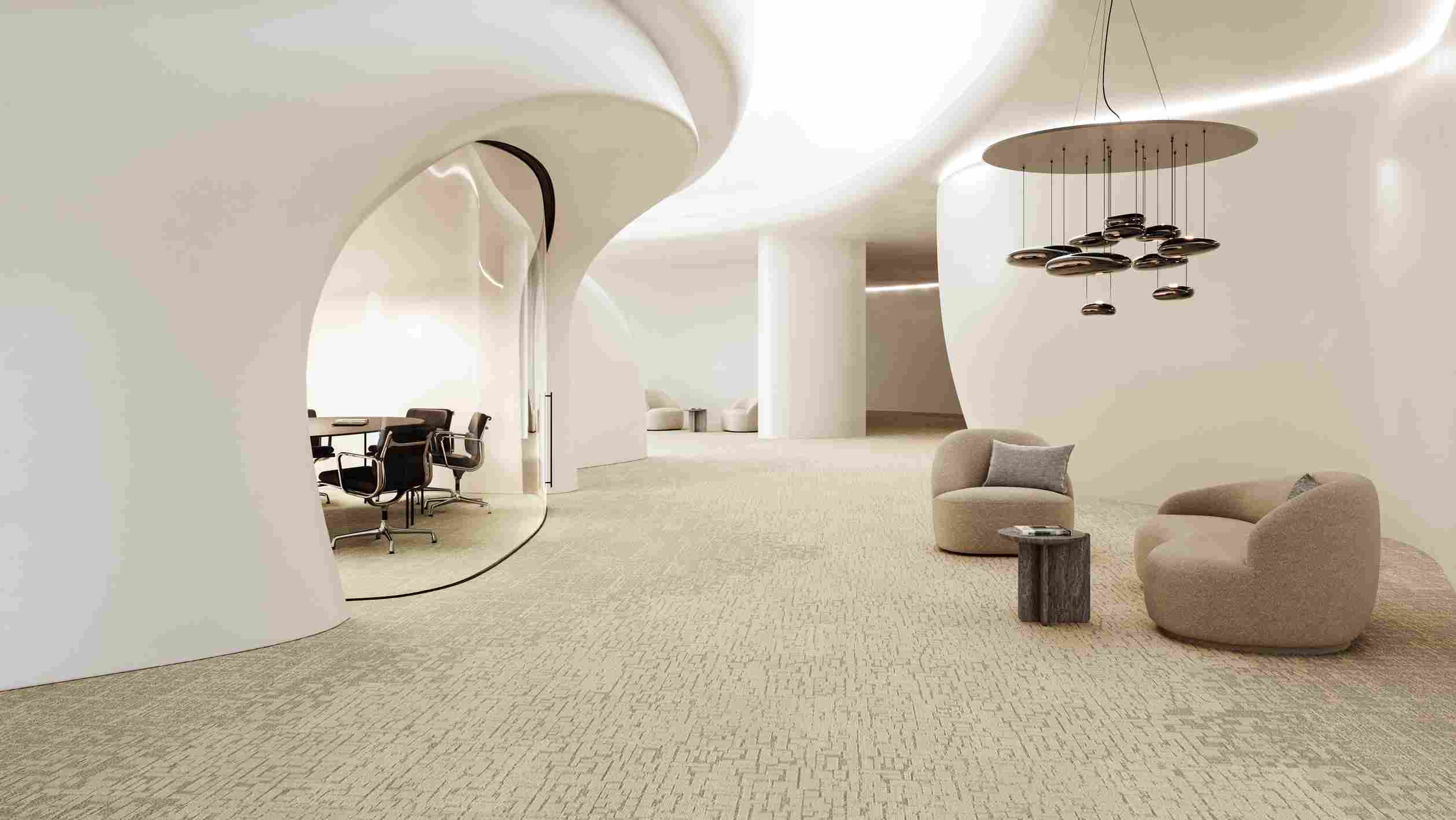
Tips for Using Complementary Colors in Flooring
The floor is one of the strongest surfaces that define a space’s atmosphere. Using contrast colors on the floor breaks monotony and adds character to the interior. To achieve the best results, consider the following tips:
-
Consider the Purpose of the Space: The impact of contrast colors varies depending on the area, such as an office, hotel lobby, or living room. Energetic tones boost motivation in offices, while more balanced contrasts work better in hotel lobbies.
-
Avoid Excess: Too much contrast can strain the eyes. If you use contrast on the floor, choose neutral tones for walls and furniture to maintain balance.
-
Use Light–Dark Balance: In small spaces, light-colored floors with dark accents create a sense of spaciousness. In larger areas, dark floors with light details can make the space feel stronger and more grounded.
-
Pay Attention to Materials: Contrast can also be reinforced through surface textures. For instance, carpet tiles or woven vinyl flooring can combine color and texture contrast to enrich the design.
-
Create a Focal Point: Instead of using contrast across the entire floor, highlight a specific area—like the entrance of a meeting room or a lounge corner—with contrasting colors for a more effective impact.
Complementary Color Suggestions Based on Application
The effect of complementary colors changes depending on the function of the space. With the right combinations, you can achieve both aesthetic and functional solutions:
-
Residential Spaces: In living rooms and bedrooms, contrast colors add vibrancy without overdoing it. For example, pastel pink details (contrasting with gray) provide visual interest while maintaining a calm atmosphere.
-
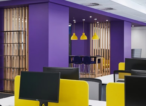
Office Spaces: Work environments benefit from energetic but not distracting contrasts. Complementary pairs like blue and orange can enhance motivation. These colors can also be used in flooring to distinguish functional zones.
-
Commercial Spaces (Stores, Cafes, Hotels): Contrast colors are powerful tools for attracting attention. For instance, black-and-white floor contrasts create a modern look, while brown–beige natural contrasts create warmth. Light tones as brown’s complement can balance the atmosphere.
-
Small Spaces: Light–dark contrast should be used carefully. Darker accents on light floors make small spaces feel larger and more open.
-
Large Spaces: In big offices or hotel lobbies, strong contrasts energize the area and clearly separate zones with different functions.
Why Are Complementary Colors Important in Interior Design?
Complementary colors provide visual dynamism and aesthetic balance in interiors. Opposite colors create focal points and eliminate monotony. Functionally, they help delineate zones or guide movement within a space.
Which Colors Are Considered Complementary?
Colors directly opposite each other on the color wheel are considered complementary. The most common examples include:
-
Red – Green
-
Blue – Orange
-
Yellow – Purple
Additionally, light–dark contrasts and warm–cool contrasts also create complementary effects.
How Should I Use Contrast When Choosing Floor Colors?
When selecting floor colors, the key rule for using contrast is maintaining balance. If the floor has a strong contrast, choose neutral colors for walls and furniture to preserve harmony. Using contrast only in certain areas (like an entrance or meeting room) is more effective than covering the entire floor.
Does Using Contrast in a Small Space Make It Feel Smaller?
Yes, improper use of contrast can make a small space feel more cramped. Overuse of dark tones on large surfaces can amplify this effect. In small areas, using dark accents on a light floor enhances openness and makes the space feel larger.
Discover